The Ultimate IELTS Bar Charts Guide
We have spoken in depth on the podcast about IELTS maps, and IELTS line graphs before, but today it is the turn of IELTS bar charts. I would say of all the possible charts that you could be given on your exam day, IELTS bar charts are the most versatile. Why? Well, not only can they be used to represent change or to show comparisons individually, but they can also be used to show changes without time! Intrigued? You should be!
In this episode, Nick and I will clearly explain
- how you should look for the key features in both change and compare IELTS bar charts
- how you can organise the items on IELTS bar bar charts into logical specific details paragraphs
- how you should approach writing the specific details paragraphs i.e. what language you should use and which information you should present first
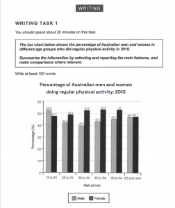
- how you should tackle IELTS bar charts that ask you to compare different age groups
Plus, we will look at charts that do not follow the usual pattern so that you can be prepared for all IELTS bar charts on your exam day.
Below, you can find a summary of the episode, which includes all of the links to useful materials and the times of each part of the discussion (so you can go directly to the part you want to listen to). You can also find every episode of the podcast here 🚀
Subscribe to My IELTS Classroom podcast on Apple podcasts here
Subscribe to My IELTS Classroom on Google podcasts here
An Introduction to IELTS Bar Charts
The versatility of IELTS Bar Charts means that this will be an advanced lesson. If you are new to IELTS report writing, you may want to watch the first three episodes in our IELTS Report Writing course. These are all available for free on our website.
However, if you already understand how to find key features, organise your paragraphs, and use the language of comparisons and change accurately, then you should find today’s lesson a great guide to tackling all IELTS bar charts.
The IELTS Bar Charts we discuss in the Podcast
The Classic IELTS Change Bar Chart
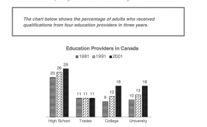
An unusual IELTS Change Bar Chart
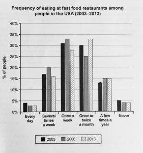
An IELTS Change Bar Chart that is really a Line Graph
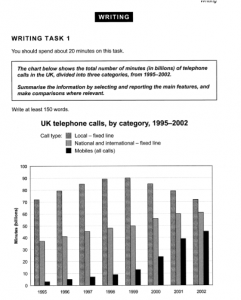
A Classic IELTS Compare Bar Chart
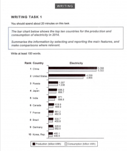
An IELTS Compare Bar Chart that is also a Change Chart!
