IELTS Line Graphs Made Easy
Last week, we focussed on General Training Writing Task One and the importance of having the tone in your letters. Today, we move to Academic Writing Task One, to look at how you can tackle the tasks to make sure that you have clear key features and make comparisons. How are we going to do that? We are going to focus on ONE type of chart – IELTS line graphs.
I think that this is the chart that students struggle with most, but is actually the easiest one to answer once you know a few simple strategies. And, guess what? Those are what we are going to show you in today’s episode!
Below, you can find a summary of the episode, which includes all of the links to useful materials and the times of each part of the discussion (so you can go directly to the part you want to listen to) 🚀
Subscribe to My IELTS Classroom podcast on Apple podcasts here
Subscribe to My IELTS Classroom on Google podcasts here
Podcast Summary: IELTS Line Graphs!
00:00 – 09:00 Introduction (What do you do when a student accuses you of lying and the only way you can prove that you are telling the truth is publishing confidential information? Listen to find out!)
09:25 – 10:30 Academic IELTS Task One: The Basic Facts
Today, Nick and I are going to take a detailed look at how you can find the key features for an IELTS line graph and organise your specific details. But, before we do that, let’s go through some basic facts about Academic Writing Task One.
- In Academic Writing Task 1, you will need to write an academic report based on a chart.
- There are lots of possible types of charts: a line graph, a bar chart, a pie chart, a table, a flow chart, or a map.However, in general, you will need language to do four main things: describe change, make comparisons, describe the stages in a process, or describe changes to a map.
- You will also need to know how to find key features in the chart and describe the specific details and support them with evidence
- It is extremely important that you mention every item on the chart or you will receive an automatic 5.0 for Task Achievement
- You report should be at least 150 words long.
11:00 – 17:15 The similarities between Academic and General Training Task One
Although writing a letter and writing a report test totally different skills, there are actually some key similarities between the two tasks.
Firstly, just as every IELTS letter is organised in the same way (with a greeting, opener, body, closer and sign off), IELTS reports also always contain the same three components. An introduction that paraphrases the task, an overview that contains the general trends, and two paragraphs of specific details. Whether or not you have a map or a car chart, you will always need these three ingredients to gain a high score. You can find out more about this in my free Introduction to Academic Reports video lesson.

In the same way, just as there are only a limited amount of functions you can be asked to perform in a letter (request, apologise, complain, etc), the range of sentence structures you will need to perform well in the report is even smaller. All you have to be able to do is describe change, make comparisons, and add statistics to your report.
Finally, just as you have to make sure you clearly address all of the bullets in the letter, you have to make sure that you mention every item in the chart but not every statistic. For example, if there are four countries in a bar chart and statistics for 3 periods (1980, 1990, and 2000), then you MUST mention every country but you do not have to mention every year. If you do not include every item, then you will receive an automatic 5.0 for Task Achievement, so be careful with charts that include 10 items!
Did you know that My IELTS Classroom has the most comprehensive course for Academic Task 1 available online?
It covers every aspect of report writing from finding key features to writing specific details paragraphs. You can even watch the first three episodes for free!

17:16 – 24:10 The unique problems of IELTS line graphs
The reason we have chosen line graphs today is that these are the charts that cause students most problems. This is because IELTS line graphs give students the opportunity to use some unique lexis that cannot be used to describe other types of chart.
For example, you can use “increase” and “decrease” to describe changes on a line graph, bar chart, pie charts, and even a table. However, expressions like hit a peak, hit a trough, overtake, fluctuate and stabilise can only be used in a line graph.
On the one hand, this is good as it gives students the chance to show off their vocabulary. However, usually what happens is that students want to use ALL of this lexis in their report, and this is a mistake. When students focus on using lexis they usually
- describe every micro-trend on the chart i.e. they are so focussed on showing the examiner all of the new words that they have learned, that they describe every up, down, up, down in the chart instead of selecting the most important data points. Describing micro-trends is the fastest way to get a 6.0 for Task Achievement.
- describe every line individually – Again, the instructions clearly say that you have to make COMPARISONS and SUMMARISE so describing every item as though they are unconnected will always result in a low score
24:11 – END Analysing three line graphs to understand how to find key features and organise your specific details
Today, Nick and I want to show you a better way to approach IELTS Charts. I could type the simple recipe that I have for guaranteed success here, but then you wouldn’t listen to the episode! So, put in your headphones, sit back, and let’s analyse these three charts together to show you how you can easily approach every IELTS line chart with ease.
Chart Number 1: How to find key features and decide which specific points to describe
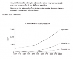
Chart Number 2: How to organise your specific details so you can make comparisons
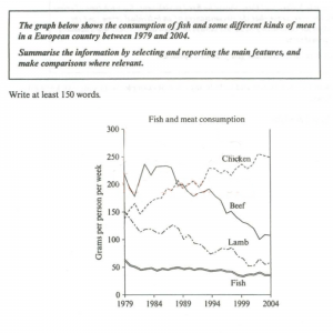
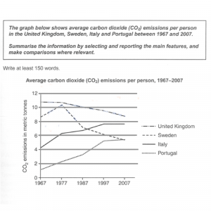
Chart Number 3: A new type of IELTS Line Graph Key Feature
I really think that this lesson is the most useful one that we have produced yet for IELTS writing. But, that is just my opinion. If you found it helpful, then let us know in the comments below 👇👇