All Cambridge IELTS 17 Academic Reports analysed
Hey! I have always loved teaching IELTS Academic Task 1. Many students are afraid of charts, but I have always found that if you teach test-takers some basic principles, then it is always possible to find the key features and organise the report well. However, this week, I was looking at the new IELTS Cambridge 17 Academic Report Questions and I have to say that two of the prompts in the current book are VERY difficult. Seriously, I am talking climbing Everest bare-foot with an elephant strapped to your back difficult.
Join Nick and I today to see which two questions those are, and how we could tackle them if they appeared in our exam. You can find the Cambridge IELTS 17 Academic Reports that Nick and I analyse in the episode below 🚀
- Subscribe to My IELTS Classroom podcast on Apple podcasts here
- Subscribe to My IELTS Classroom on Google podcasts here
Cambridge IELTS 17 Academic Reports
In the episode Nick and I will discuss how we would approach each of the Cambridge IELTS 17 Academic Reports. To get the most out of the episode, we recommend that you spend some time looking at the prompts yourself to decide:
- What the key features of the chart are. You should look for 2 or 3 for each chart – these will be put into your overview.
- How you will organise the specific details in your report. You will need two paragraphs of specific details. Think about which items you will place in the first paragraph and which in the second. To do this, you should think about which organisation will give you the best chance to summarise and compare the items. In general, you either want to group items that are similar or that show a contrast.
- If you have the language needed to write about the chart. The great thing about IELTS Academic Reports is that they require you to use a limited range of language. However, it never fails to amaze me how many students still do not have enough language to describe change and make comparisons. Don’t be one!
Did you know that My IELTS Classroom has the most comprehensive course for Academic Task 1 available online?
It covers every aspect of report writing from finding key features to writing specific details paragraphs. You can even watch the first three episodes for free!
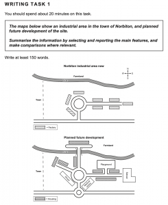
Test One – The Map of an Industrial Area in the Town of Norbiton
Nick and I looked at maps in a recent podcast, which you can listen to here. My advice for this task would be to think carefully how you will organise your specific details paragraphs. Do you want to separate the map into areas, o would it better between to have one paragraph that describes the industrial area now, and one that explains the proposed changes? I think that one approach is much better than the other!
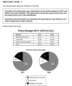
Test Two – Police Budgets in One Area of Britain in 2017 and 2018
I always call reports that include two different charts “Double Trouble” prompts, as they can cause test-takers a lot of headaches. However, this question is about as easy as it gets. Just remember to include at least one key feature for each chart in your overview!
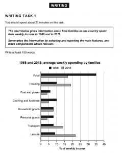
Test Three – Family spending in one country in 1968 and 2018
At first glance, this looks like a “friendly” bar chart. There are clear increases and decreases in different areas of spending, and a good student would hope to find some connection between those that had increased and those that had decreased. However, as you will see, a connection is difficult to find, which makes writing the overview tough. Listen to how Nick and I resolved this issue in the podcast. As you will see, as far as change bar charts go, this is about as hard as it gets!
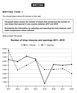
Test Four – Shops opening and closing in one country between 2011 and 2018
I have to say that this prompt is really very challenging indeed. Although you only have two items to describe (openings and closings), the format of the task is very different to traditional line graphs (even the new ones that Nick and I discussed last year in this episode). And even high-level students who understand that the key to describing this chart successfully is comparing the openings and closings in every year, will find it hard to summarise effectively.
Overall, despite appearing to be a simply chart, I think that this is one of the hardest that have appeared in the Cambridge Books in recent years! Good luck!