
A new type of IELTS line graph 2021?
In 2020, Nick and I recorded an episode of the podcast that gave you a complete fool-proof system for tackling any type of IELTS line graph. We went through the basics, such as the vocabulary you need to describe changes and how to organise your paragraphs, to more complex advice such as how to find key features and write your specific details from start to finish. Plus, we also looked at a new type of key feature that IELTS had recently started using and no other teacher was talking about. In other words, I felt like we had recorded the ultimate guide to IELTS line graphs, and we would never have to talk about them again. Then came the IELTS line graph 2021!
Yes, in Cambridge 15, I noticed that IELTS had subtly introduced a new type of line graph.
It wasn’t obvious at first, but then came another similar chart in Cambridge 16, and suddenly I realised that a whole new system was needed to tackle this new type of chart well. Today, Nick and I review the old “system” (which still works perfectly well for 99% of charts) and then show you how to approach the IELTS line graph 2021 differently.
Below, you can find a summary of the episode, which includes all of the links to useful materials and the times of each part of the discussion (so you can go directly to the part you want to listen to) 🚀
- Subscribe to My IELTS Classroom podcast on Apple podcasts here
- Subscribe to My IELTS Classroom on Google podcasts here
- Become a Patreon to gain access to extra BONUS episodes here
The Standard IELTS line graph
Every IELTS line graph is unique but, until recently, there was a system that you could use to tackle all of them. This is the system that we discuss in the earlier podcast (again, you can listen here) and which you already hopefully know. However, let’s quickly review the three stages now.
Step 1- Find the Key Features
The most important paragraph in any IELTS report is the overview. Why? Well, very simply, if you do not outline the most important trends seen in the chart, you will only receive a maximum of 6.0 for Task Achievement. In general, we are looking for a maximum of three key features that can ideally be expressed in two sentences. As line graphs always show change, this is a relatively simple procedure. I would recommend that you look for the following features in this order.
- Overall change (i.e. what is happening to all the items on the chart in terms of increases and decrease)
- Items that are highest / lowest in number
- A period of time that has the most change
- Items that have the same pattern or change
- The gap between the items reducing or growing
You will always need to include the first key feature (overall change) and usually this and the second key feature (item that is highest / lowest) will be enough to write your overview. However, although the five general trends above will be enough to cover almost every chart, you will need to look at the chart you have been given to see if there are any other clear trends i.e. it is great to follow a system, but you still have to use your own brain!
In the episode, we look at this line graph. What do you think the main key features are? Write them down.
![]()
Step 2- Decide how you will organise your Specific Details Paragraphs
Once you have your key features, the next step is working out how you will organise your specific details paragraphs. Remember we are given points for comparing items, so we want to organise our paragraphs in a way that will naturally allow us to do this. I would recommend that you either
- group items that have the same trend (i.e. those that increase or those that decrease) OR
- group items that have the opposite trends (i.e. the highest / lowest OR those that start at the same point but then have different patterns)
There is no “right way” to organise but you absolutely must have some logic behind you organisation. In fact, to increase your score for Coherence and Cohesion you should tell the examiner why you have placed items together in the first sentence of your specific details paragraph.
Look again at the line graph. Which items will you place in SDP1 and which will you place in SDP2? Why?
Step 3- Write your IELTS line graph report using our simple system
Now that you know the key features of the line graph and how you will organise your specific details paragraphs, you are ready to write. The first two steps are easy. First, you will paraphrase the task to write your introduction and then describe the key features that you have found in the overview. You can write the overview as a separate paragraph (which I recommend) or in the same paragraph are the introduction. Trust me – no examiner cares which you choose!
Once that is done, you are ready to write the specific details paragraphs. You have already decided how they will be organised, so all you need to do is follow our simple system for writing line graph reports.
- Start by describing ONE item completely (i.e. from start to end). This is usually the item that started in the highest position. Why? Because tour brains like to have a fixed point that we can then compare back to. You should always include the starting and ending points on the chart, so make sure you include those and any other IMPORTANT points. DO NOT describe every change. One common error in line graph reports is having too much micro-detail. Only include the points that are important (if there are any)
- Then, after you have described first item fully, you can describe the second, but this time try to COMPARE back to the first. For example, you can say things like “ X started slightly lower than Y” OR “X followed a similar pattern”. Now you can also use phrases like “X showed the same pattern” or “X overtook Y” if they are relevant.
- Now move to the second specific details paragraph. This should contain the least interesting trends and may be shorter than SDP1. However, try to make as many comparisons as you can (again usually this will include overtakes and final positions) but remember the key rule: never compare to an item that has not been introduced yet
If you would like to listen to us discuss this system in detail, then you really should listen to the previous “Line Graphs Made Easy” where we go through each stage in detail – just click here.
However, if you follow those stages, then you should end up with a report that looks something like this:
The line graph illustrates how much chicken, beef, lamb and fish was consumed in a single country in Europe over a 15-year period (1979 to 2004). Units are measured in grams per person per week.
Overall, it can be clearly seen that consumption of all types of meat and fish decreased, with the exception of chicken. As a result, although beef was eaten most in 1979, chicken was the most highly consumed in 1984.
Beef and chicken were the most and least consumed meat in 1989. Consumption of beef started at around 220g and, despite dipping to roughly 180g in 1984, recovered to hit a peak of 240g in 1984. However, from this point, consumption fell sharply, ending at less than half its original value at 100g. The grams of fish consumed also fell slightly from just over 50g to just under, making it the least consumed meat throughout the period.
As for lamb and chicken, despite starting with roughly the same level of consumption (150g), they saw opposite trends. While consumption of lamb fell steeply to end just above fish at 70g, that of chicken grew sharply, overtaking beef in 1989 at 200g. In fact, by the end of the period, beef and chicken had more or less reversed positions, with the latter ending with the highest consumption of all items in all years at 250g.
Did you know that My IELTS Classroom has the most comprehensive course for Academic Task 1 available online?
It covers every aspect of report writing from finding key features to writing specific details paragraphs. You can even watch the first three episodes for free!
The IELTS line graph 2021
Once I had devised that simple strategy for tackling line graphs, I really did think that my job as a teacher was done. However, in Cambridge 15, this chart appeared and my intuition told me that something was different. What do you think? Have a look and tell me what do you think is different about this line graph to the one that we just looked at?
You may at this point be scratching your head and saying you do not know. That’s OK. It took me almost 6 months to understand what was happening here and why it required a different approach. You see, dozens of students had approached this chart in the same way as usual. They had written a fairly basic overview like this:
Overall, it can clearly be seen that the number of visitors to both types of accommodation grew over the period, although those staying on cruise ships grew more than those staying on the island. As a result, the total number of visitors also grew.
And, honestly, this is totally fine! In fact, if you are aiming for a 6.5 or even a 7.0, this is fantastic. They had then gone on to compare the visitors staying on the island to those staying on cruise ships in SDP1, before describing the total numbers in SDP2.
Again this was “fine”, but it never felt right to me as the final paragraph about total numbers was always short and far too simplistic. I mean – look at that chart again. What can we really say about the total numbers apart from that they grew steadily. Then, one day I was sat in class marking with a student, it suddenly hit me what I was missing.
The total figure is strongly connected to the other two items.
I know that this may sound like a simple observation, but think about it carefully. Look at the chart again. Yes, the total number of tourists is increasing throughout the period, but WHY is it increasing?
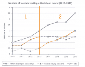
In the first three years, the total number or visitors increases because the number visitors staying on the island increased (while those staying on cruise ships stayed the same) whereas in the final four years, the total number of visitors increases because the number staying cruise ships increased (whereas those staying on the island stayed more or less the same)!
Seeing this was transformative not only in the way that I would recommend you write the overview (as surely noting the change in what contributes to the total is more insightful than simply stating that it “increases”) but also in the way that we should approach our paragraphing. You see, as the total number reflects what is happening to the individual items, it makes much more sense to include it alongside the description of the items. Therefore, for this chart, it would be much better to organise our specific details paragraphs according to TIME (which is NOT what I would usually recommend).
If you do this, you end up with a much more rich and detailed explanation of the chart, and one that I think will give you a chance of a far higher score.
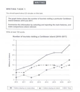
The line graph shows how many tourists went to one Caribbean Island over a seven-year period (2010 – 2017) and whether they stayed on the island or on a cruise ship.
Overall, it can be clearly seen that while the total number of visitors rose steadily throughout the period, this increase was due to a growth in tourists staying on the island in the first three years and a growth in those staying on cruise ships in the last four.
In the first three years, the number of visitors staying on the island grew considerably. Starting at 0.75 million, which was three quarters of all visitors in 2010. the figure doubled to 1.5 million in 2013. In contrast, tourists on cruise ships fluctuated between 0.25 and 0.5 million and saw no increase. As a result, while total tourist numbers also doubled from 1 million to 2, the rise was solely due to the growth in island stays.
However, in the final four years the opposite trend was seen. While the number of visitors to the island remained flat at 1 million, those on cruise ships started to rise rapidly, almost tripling to 1.25 million in 2015. In fact, a further dip in island visits meant that they were overtaken by cruise ship stays in mid-2015 at 1.4 million, and by the end of the period were a full 0.5 million lower (1.5 million compared to 2). Consequently, although the total number of visitors continued to rise to 3.5 million, this was due only to cruise ship stays.
I appreciate that this is a rather long report, but if you are a student who is looking for an 8.0 or 9.0, then this approach would give you a far better chance of achieving one. More importantly, this new IELTS Line Graph 2021 appeared again in Cambridge 16.
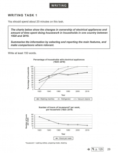
Look at the chart below. It is slightly different as this time we do not have a “total” on the chart but instead a second chart that shows a figure that is clearly related to the first (i.e. the number of hours of housework is obviously connected to the number of household that have a household appliance). Therefore, I would strongly recommend you use the same approach for the report, dividing your paragraphs by time and placing the information for the hours of housework at the end of each paragraph.
In fact, why not try to write the report now and copy and paste it into the comment box below?