How to tackle the dreaded IELTS table
In IELTS Writing Task One, you will be asked to write a report based on a chart. These can come in a number of forms. You may be given a line graph, a pie chart, a bar chart, or even a map or a process. However, one chart that strikes fear into the heart of most students is the dreaded IELTS table.
IELTS tables can be confusing as they can contain an overwhelming amount of data and it is not always clear what key features need to be included in the overview. However, in today’s episode, Nick and I will show you a simple strategy that will help you tackle any type of table with confidence.
Below, you can find a summary of the episode, which includes all of the links to useful materials and the times of each part of the discussion (so you can go directly to the part you want to listen to) 🚀
- Subscribe to My IELTS Classroom podcast on Apple podcasts here
- Subscribe to My IELTS Classroom on Google podcasts here
- Become a Patreon to gain access to extra BONUS episodes here
The Four Types of IELTS Table
I think one thing confusing about IELTS tables is that there are so many different types or permutations. This means that no one system of approaching the questions is going to work. However, the most simple piece of advice I can offer is to make sure you consider all of the different changes or comparisons shown when finding your key features. If you can do this, you are pretty much 100% guaranteed to get a 7.0 for Task Achievement.
Let’s look then at the four different IELTS tables to show you what those changes and comparisons are, and how you should organise your specific details paragraph as a result.
An IELTS table that shows time, category, and individual items
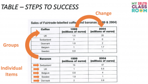
Let’s start with the table that shows the most information – a change table that is divided into categories.If you had this chart in the exam, what key features would come up with for your overview? I think that we should look at:
- Compare changes over time (i.e look at the increases / decreases that happened between 1999 to 2004)
- Compare the two categories (i.e compare total coffee sales and total banana sales)
- Compare the individual items (i.e. compare the 5 countries)
In other words, we should break down the table into the three pieces of information that it clearly shows in the headings of the table:
Once you have these three pieces of information, all you need to do is put them together into one paragraph to create your overview. I would try to do this in two sentences if you can to avoid it becoming too long:
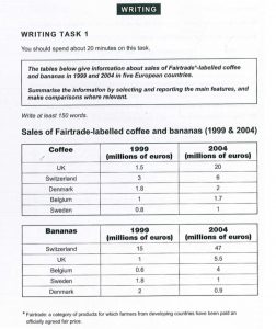
Overall, it can be clearly seen that while the sales of coffee rose in all countries, those of bananas fell in two. Total coffee sales were also higher than bananas sales, with the UK and Switzerland having much higher figures than the other three countries for both products.
What about organising your IELTS table report?
As there are three different pieces of information in this IELTS table, we have three possible ways to organise our chart.
- First, we could divide our paragraphs according to time (i.e. BP1 = all information for 1999 and BP2 = all information for 2004). Obviously this would be a disaster as it would not allow us to make any comparisons.
- Our second option would be to divide our paragraphs according to category (i.e. BP1 = all information for Bananas and BP2 = all information for Bananas). I think that this would be a good, straight-forward approach. Just makes sure that when you write BP2 you make some comparisons back to BP1.
- Finally, we could divide our paragraphs according to countries. This is also a good approach, but it takes more effort and planning as you will need to decide which countries to group together. When you take this approach, you want to try to discuss items with similar trends in each paragraph. The good news here is that the countries are easy to divide as the UK and Switzerland have the highest sales in both categories and have the biggest increases. Therefore, I would describe the statistics for Coffee and Bananas in the UK and Switzerland in BP1, and those for Belgium, Sweden, and Denmark in BP2.
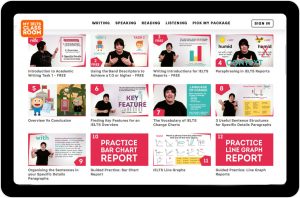
Did you know that My IELTS Classroom has the most comprehensive course for Academic Task 1 available online?
It covers every aspect of report writing from finding key features to writing specific details paragraphs. You can even watch the first three episodes for free!
An IELTS table with no “categories”
Let’s move then to our second type of chart. Obviously, this is still a change chart as we are shown statistics for two years and we have 8 individual items, but what we are missing are the categories.
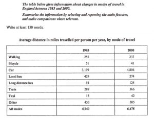
This means we only have two pieces of information to look at:
- Compare changes over time (i.e look at the increases / decreases that happened between 1985 to 2000)
- Compare the 9 individual items (i.e. compare the 8 types of transport and the total)
However, when we do not have categories to compare, we may want to divide the items to create our own categories. How will we do this? Well, we will look at the individual items to see if there are any patterns in terms of increases / decreases or highest / lowest. Here, there is a clear division between motorised and non-motorised forms of transport.
Overall, it can be clearly seen that while the average distance travelled by all motorised transport increased, with the exception of local bus, all non-motorised transport fell. In terms of individual forms of transport, people travelled the most kilometres in both periods by car and this form saw the biggest increase.
What about organising your IELTS table report?
This distinction not only helps us to write the the overview, but it also allows us to organise our report too. Obviously, we cannot organise by time, so we are going to have to divide our items into two groups. I would do this based on increases / decreases:
- SDP1 (motorised transport) = Car / trains / taxis / long distance bus / other
- SDP1 (non-motorised transport +exception + total ) = Walking / bicycle / local bus / total
An IELTS table with no changes
In general then, when we have an IELTS table that shows changes over time, we want to focus first on the changes. However, what happens when we have a chart that has no changes? How should we approach this? For example, look at the chart below. What key features would come up with for your overview this time?
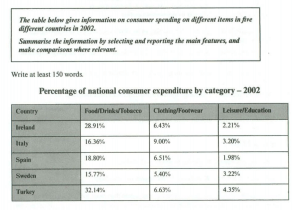
As there is only one year and no need to look for any change, I think all we can do is
- Compare the two categories (i.e compare the spending on food, tobacco and drink / clothing and footwear / leisure and education )
- Compare the individual items (i.e. compare the 5 countries)
As we have no changes, I would focus most on comparatives (more / less) and superlatives (highest / lowest) as you do this:
Overall, it can be clearly seen that all four countries spent more on food, drinks and tobacco than the other two categories. In terms of individual spending, while Italy had the highest expenditure on clothing and footwear, Turkey spent the most on the other two categories.
What about organising your IELTS table report?
In terms of organisation, we have two options – dividing by category or by dividing country. Usually, I would recommend using the items (as we did in the IELTS table about forms of transport above) and grouping those with a similar patterns of spending together. However, in this chart the statistics are so similar for each country that I think it is better to divide by category. This will mean that we need three specific details paragraphs:
- BP1 = all countries spending on food, tobacco and drink
- BP2 = all countries spending on clothing and footwear
- BP3 = all countries spending on leisure and education
Worried about having three body paragraphs? Don’t be! Just like essays, there is no one “correct” way to structure a report. 99% of the time you will only need two specific details paragraphs, but if you feel that a report is more logical with three, then have three!
An unusual IELTS table
Finally, not every chart follows one of the three main patterns above, so you may have to think on your feet. Join us in the podcast to listen to how Nick and i would approach this chart!
If you found this episode useful, then I would recommend that you listen to a similar episode that we did last year for line graph charts.