
How to find the main key feature for an IELTS Change Chart Overview
Hey! If you are an Academic IELTS student, you should know that you cannot get more than a 6.0 for Task Achievement if you don’t have an overview that summarises the general trends of the chart. Now, there is usually more than one key feature in a chart, but there is almost always one that summarises all of the items on the chart. I call this the “main key feature” as it is the most important and the most valuable in terms of points. I teach my students how to find this main key feature on the first day of class. Obviously, it will depend on the type of chart you are given (the main key feature of a map will not be the same as the one for a pie chart) but in today’s blog, I want to show you how to find the main key feature for an IELTS Change Chart Overview 📊
IELTS Overview: The Basics
OK, in Academic Task 1, the main criteria for achieving a 7.0 or higher for Task Achievement is having a clear overview that presents the main trends.
An overview is a paragraph that contains the KEY FEATURES of a chart 📈. It should come directly after your introductory sentence and contain information that summarises the chart.
This leads to the question – what are key features? 🗝️ Well, they are the general trends that are shown in the chart. They are NOT specific details or individual changes, so they do not contain statistics or individual features of a chart. Instead, they are sentences that summarise the main changes shown in the chart. Think of it like this:
Imagine that you are on the telephone to a friend who cannot see the chart and they ask you what the chart shows. ☎️ You wouldn’t start giving them long lists of statistics or small details would you? No! You would try to summarise what you can see in the chart in a couple of simple sentences. These are the key features.
IELTS Key Feature: The Facts 🗝️
- Key Features should be WORDS ONLY (NO statistics)
- Key Features should focus on what is happening IN GENERAL (so don’t list changes to individual items on the chart)
- Every chart has ONE MAIN KEY FEATURE (This is the key feature that describes every item on the chart in ONE sentence. The main key feature should not describe individual items or individual years
- Good overviews contain TWO or THREE key features (but start with the main key feature)
- Good overviews have key features which are connected together with cohesive devices – THEY ARE NOT A LIST
So, let’s try to write an overview for an IELTS change chart. I would like you to look at the chart below and write down the 2 or 3 sentences that you think summarise the information i.e. write down the key features that you would include in your overview.
Then look at the sentences you have written and decide which one is the main key feature? In other words, which one of your sentences summarise ALL of the information in the chart in one sentence? This is the key feature that you will use to start your overview (as it is the one that scores the most points!)
Spend no more than 5 minutes doing this ⏰ (and DON’T cheat by scrolling down and checking the answers!!!) 😜
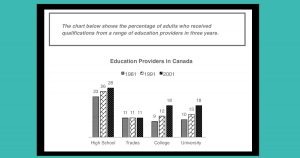
OK. How did you get on? Tell me, what was your main key feature? Which one key feature would you use to start your overview? Let me guess. Was it this?
Is this the MAIN key feature?
Canadian adults received the most qualifications from High Schools but the least from Trades.
👎 !!NO!! 👎
This is a common mistake! Students automatically focus on the highest figure and lowest figures in a chart when they look for general trends, but these sentences only tell me about two items on the chart! Remember, the main key feature should describe every item. This is a key feature, but is not the main key feature.
In fact, sentences that describe the most and least can NEVER be the main key feature in a change chart! Why not? Well, if you have a chart that gives information for more than one year, you need to focus on the CHANGES! In other words, you have to focus on the increases and decreases, not the highest and lowest.
Is this the MAIN key feature?
Almost an equal number of adults received a qualification from Colleges and Universities in each of the three time periods.
👎 !!NO!! 👎
I think that this is a great key feature for this chart. Look at Colleges and Universities! Their numbers are very similar in every year and making meaningful comparisons is what we need to achieve a 7.0 or higher for Task Achievement. However, again, this sentence only tells me about two items on the chart, but for the main key feature, I need one that summarises all the items.
Is this the MAIN key feature?
While the percentage of people who gained qualifications from High Schools, Colleges and Universities rose over the 20 year period, those receiving them from Trades remained stable.
👎 !!NO!! 👎
OK, how many of you have written this? My guess is around 80% of you. Does this sentence mention all of the items on the chart? Yes, it does. So, what is the problem? The main key feature should speak in general. That means you want to avoid simply listing the items on the chart. This sentence is factually true, and it does describes the changes, but it doesn’t do enough to summarise them. If you have written this sentence, you are very close to finding the main key feature – you just need to go once step further.
Did you know that My IELTS Classroom has the most comprehensive course for Academic Task 1 available online?
It covers every aspect of report writing from finding key features to writing specific details paragraphs. You can even watch the first three episodes for free!
How can I find the main key feature?
Remember, we were looking for ONE sentence that summarises all of the information in the chart. As this is a change chart, we should focus on what has changed (which sounds obvious, but for many students it’s not!) The easiest way to see and summarise the changes is to draw arrows onto the chart so that we can see quickly which items increased, which decreased, and which remained the same.
👉 THIS WILL HELP US SEE THE GENERAL PATTERN 👈
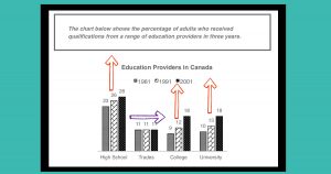
Now we’ve got our arrows, it is obvious that, in general, the percentage of adults who got a qualification increased in all educational sectors except Trades. So, that means our main key feature should be:
Is this the MAIN key feature?
Overall, the percentage of Canadian adults who received qualifications increased for all educational providers, with the exception of Trades, which remained stable.
💥 Yes, it is!💥
Now, this is more or less the same as the previous key feature, but, rather than mentioning each of the items individually, we have summarised the changes into a more general sentence. If you telephoned your friend and told them this sentence, it would be very easy for them to visualise the chart. That is what we want from our main key feature.
How can we put the key features together in the overview?
So, now we have our main key feature, we are ready to write our complete overview. Remember, we should include 2 or 3 key features, but START with the main one
Overall, it is clear that the percentage of Canadian adults who received qualifications increased for all educational providers, with the exception of Trades, which remained stable. In terms of individual institutes, High Schools provided Canadian adults with the most qualifications, while universities and colleges had almost the same number of qualified graduates in each year.
Now we have an overview that is worthy of not just a 7.0, but an 8.0 or a 9.0. Why? Well….
- it starts with the main key feature (which describes EVERY item in ONE sentence)
- it continues with more GENERAL trends (it never mentions statistics)
- it can be easily understood without looking at the chart
- all of the key features are CONNECTED with cohesive devices (see underlined part of text)
- it perfectly summarises all of the information in the chart
So, this is how you should find main key features for an IELTS change chart overview – DRAW ARROWS onto the chart to see what is happening in GENERAL.
In my Academic Writing Task 1 course I will teach you how to find the main key feature for ANY type of IELTS chart. And I mean ANY! And just like we saw today – the key to learning is NOT just watching videos, it is DOING! 🚀